We have been working hard lately to revamp the EpicPrefs Editor, and we will present you the major changes here before they go live!
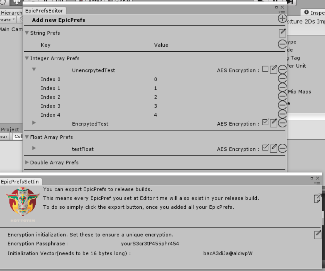
In the previous version of the editor, we cramped the settings like passphrase etc. into the main panel, and fixed it on top. This took alot of space, and some users contacted us with suggestions on how to improve. So we did listen to you and split up the settings part from the main Editor. This leaves you with a clean window that is really dedicated to EpicPrefs and the edition of them.
A second user suggestion was concerning the colors. When we first designed the EpicPrefsEditor, we wanted it to stand out, so we put alot of effort into the design of it. We colorized it, applied custom fonts and colors everywhere and made it look completly standalone. However, we neglected that many users might not even want this. Many prefer a streamlined UI, fitting into the rest of Unity. So with this new version, we redesigned the editor completly to make it match to the rest of Unity!
However, don't fear if you preferred the fancy colors, you will be able to select the theme from the newly added settings page!
We hope you like the changes and if you got more suggestions, we would be happy to know about them! We always look to improve our assets, so keep your ideas coming!
Here is a little preview of the upcoming UI :