Today we are going to take a look at our brand new Plugin : A RoundedContentView!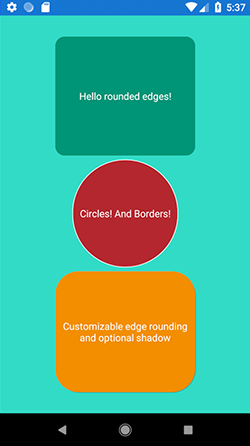
This is a .NET Standard Plugin and supports both iOS and Android! It is the first in a series of Xamarin.Forms plugins that we will be releasing in the future, and it is all open source!
So without further ado, let's see how one can use this!
First of all, you need to grad the nuget package. Open up the Nuget Package manager, search for HotTotem.RoundedContentView and install it into every of your projects. Next, simply pull up your XAML pages and start using this RoundedContentView the same way you would use any ContentView! Let's reproduce the above sample.
First of all, reference the package to make use of it. In your XAML file, add the following to your outer Page element :
xmlns:hottotem="clr-namespace:HotTotem.RoundedContentView;assembly=HotTotem.RoundedContentView"
Now you can use the RoundedContentView anywhere in your XAML :
<?xml version="1.0" encoding="utf-8" ?>
<ContentPage xmlns="http://xamarin.com/schemas/2014/forms"
             xmlns:x="http://schemas.microsoft.com/winfx/2009/xaml"
             xmlns:local="clr-namespace:PluginTester"
             xmlns:hottotem="clr-namespace:HotTotem.RoundedContentView;assembly=HotTotem.RoundedContentView"
             x:Class="PluginTester.MainPage" BackgroundColor="White">
    <StackLayout HorizontalOptions="FillAndExpand" VerticalOptions="FillAndExpand" BackgroundColor="#32dbc5" Padding="30">
        <hottotem:RoundedContentView HorizontalOptions="Center" WidthRequest="200" HeightRequest="200" VerticalOptions="Center" CornerRadius="20" FillColor="#009577">
            <Label Text="Hello rounded edges!" TextColor="White" VerticalOptions="FillAndExpand" HorizontalTextAlignment="Center" VerticalTextAlignment="Center"/>
        </hottotem:RoundedContentView>
        <hottotem:RoundedContentView HorizontalOptions="Center" BorderColor="White" BorderWidth="3" WidthRequest="150" HeightRequest="180" VerticalOptions="Center" Circle="True" FillColor="#b4252d">
            <Label Text="Circles! And Borders!" TextColor="White" VerticalOptions="FillAndExpand" HorizontalTextAlignment="Center" VerticalTextAlignment="Center"/>
        </hottotem:RoundedContentView>
        <hottotem:RoundedContentView HorizontalOptions="Center" HasShadow="True" WidthRequest="200" HeightRequest="200" VerticalOptions="Center" CornerRadius="50" FillColor="#f28e00">
            <Label Text="Customizable edge rounding and optional shadow"  TextColor="White" VerticalOptions="FillAndExpand" HorizontalTextAlignment="Center" VerticalTextAlignment="Center"/>
        </hottotem:RoundedContentView>
    </StackLayout>
</ContentPage>
The above code will reproduce the sample image at the beginning. Now lets take a look at the different options you are offered :
- CornerRadius : As the name says, this will be the radius applied to the rounded corners. This is an integer and defaults to 0, so not rounded.
- FillColor : This will allow you to set the background color of the RoundedContentView. The difference between this and BackgroundColor is that the FillColor will be Rounded off in case of a rounded edge being applied, and the BackgroundColor will not. You can either use Hex-Codes or the proposed predefined Colors.
- Circle : This property allows you to make the edges rounded until they touch each other. This means at least 2 edges will be circular. If your ContentView has the same height as width, it will be a circle. This is a boolean. Defaults to false.
- HasShadow : If this boolean is set to true, the ContentView will drop a shadow, otherwise not. Defaults to no shadow.
- BorderWidth : You can apply a border to your RoundedContentView ( as seen in the second box ) and here you can set its width as an integer. Defaults to 0.
- BorderColor : Guess what, this will allow you to set the color of your Border. Of course, only if you set a BorderWidth. Defaults to white.
So there you go, these are all the customizable settings! Have fun with this rounded view and spread the word! If you make use of it in any of your apps, let me know if you like to!
Want to see the source code ? Take a look here on GitHub
The Nuget can be found here :